Tips and tricks in data visualization
Good data visualization, apart from presenting your data in the best possible way, needs to be easy to understand and adapted to your target audience. Below are some rules that your visualization needs to follow in order to reach its full potential and deliver the message clearly.
Plotting
Clutter is something you should definitely avoid when visualizing data. Looking at the visualization should be pleasant to an eye, and understanding it should be as intuitive as possible. Good visualization is the one you are able to understand in under 30 seconds.
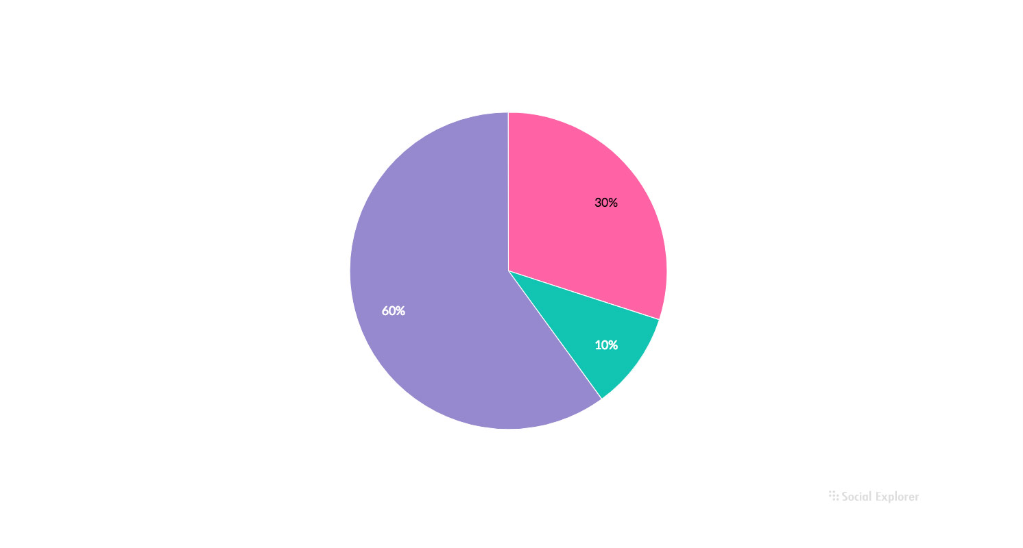
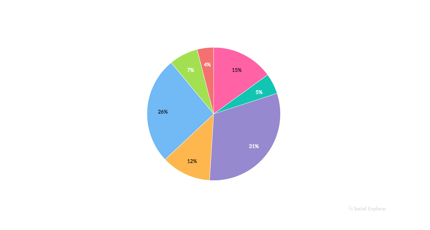
- Try not to visualize more than 5 categories on a pie chart
Visualizing too many categories on a chart makes it harder for users to compare them.
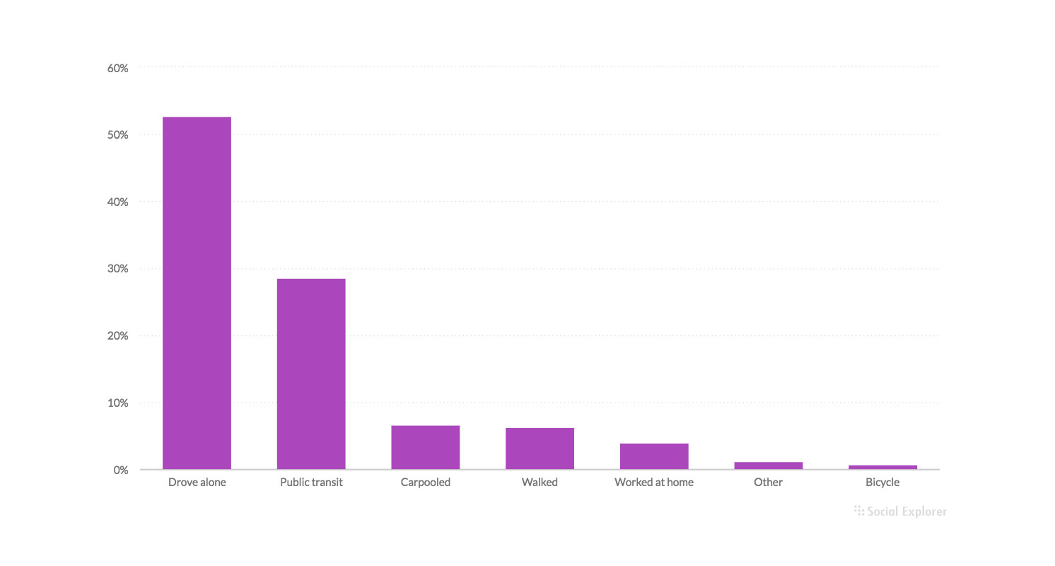
Good
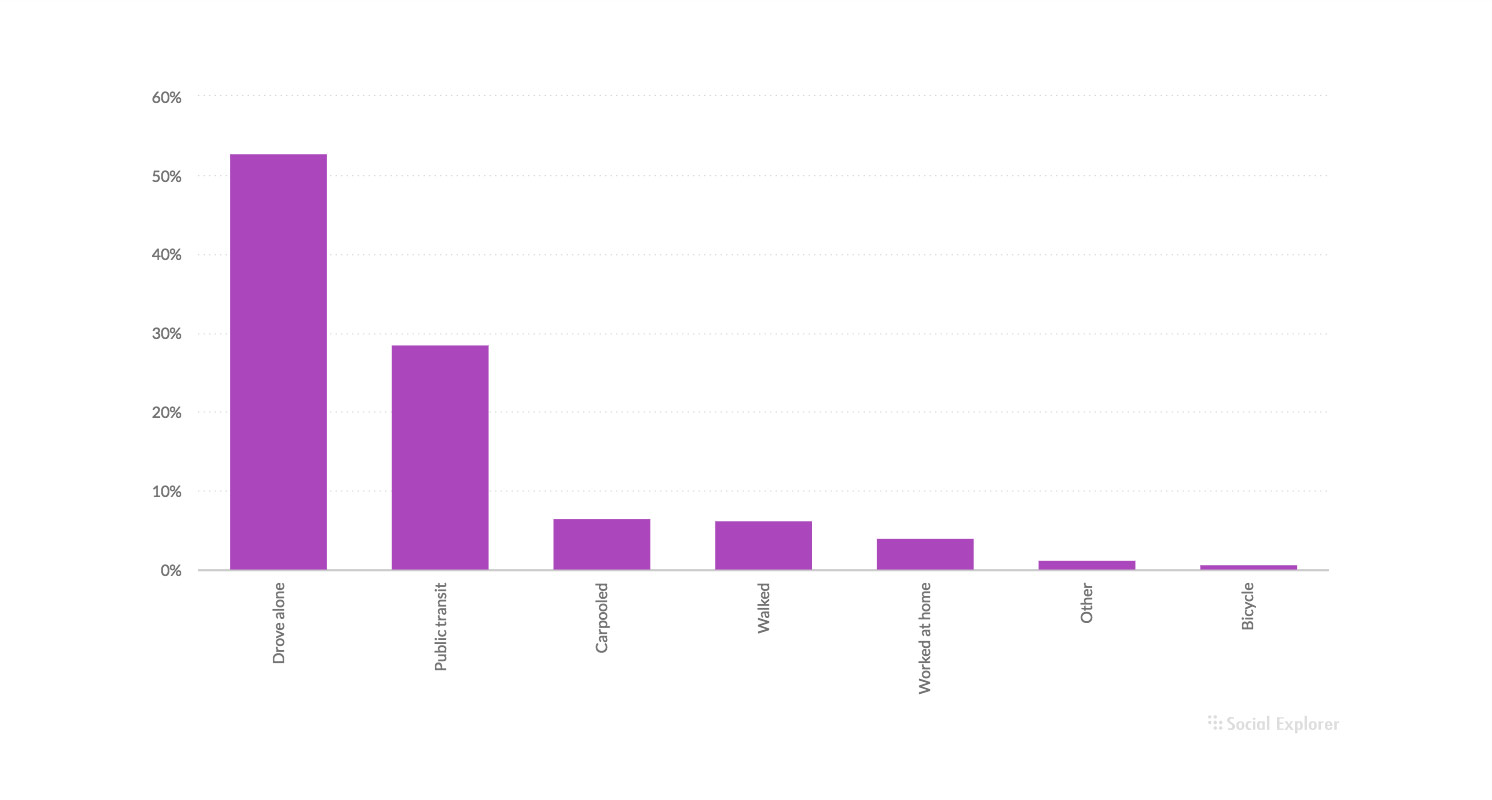
Bad
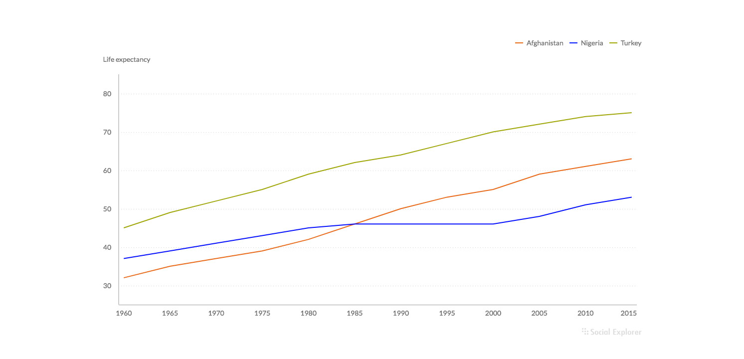
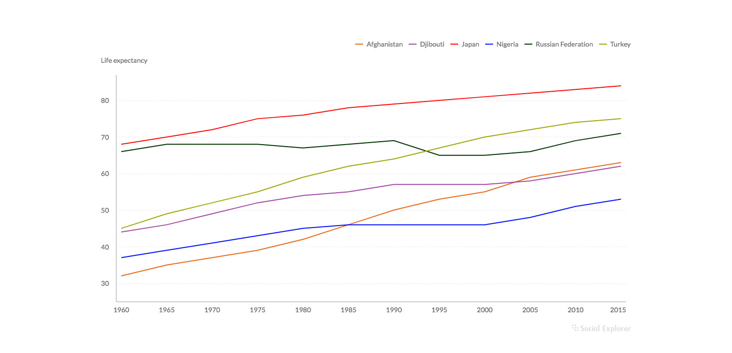
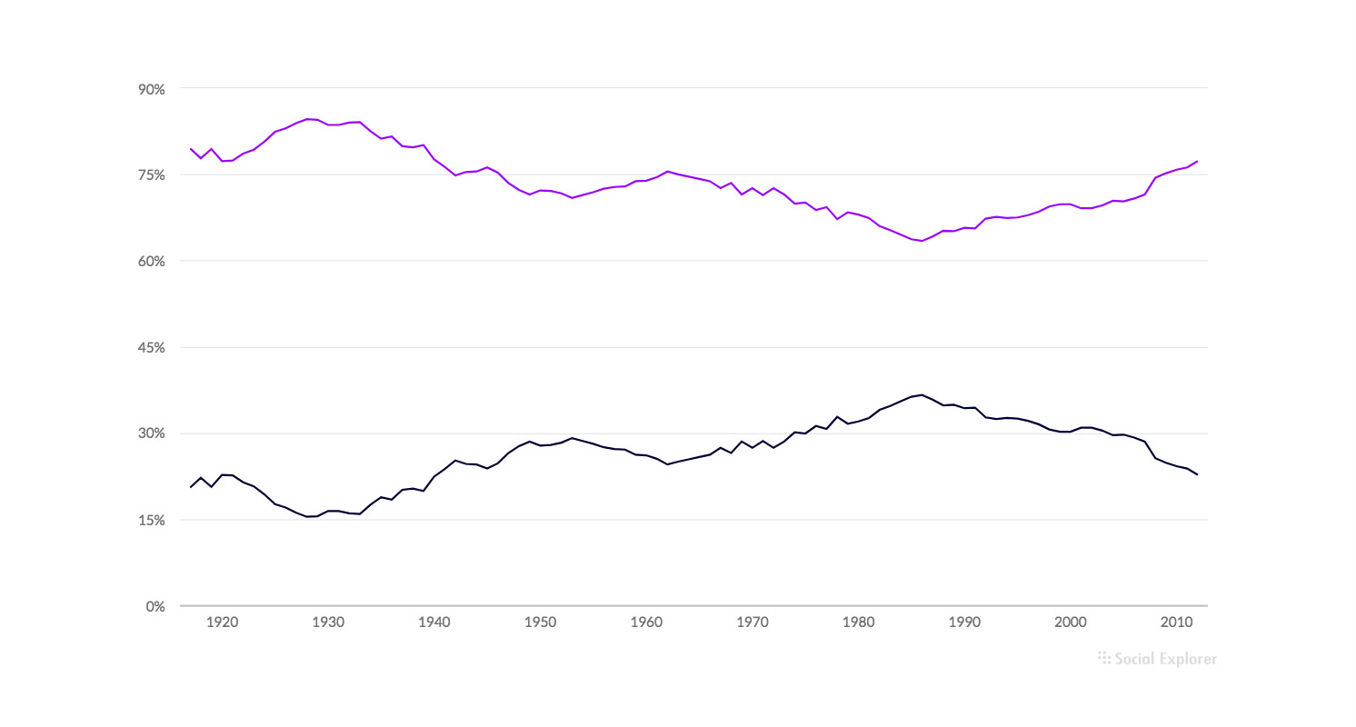
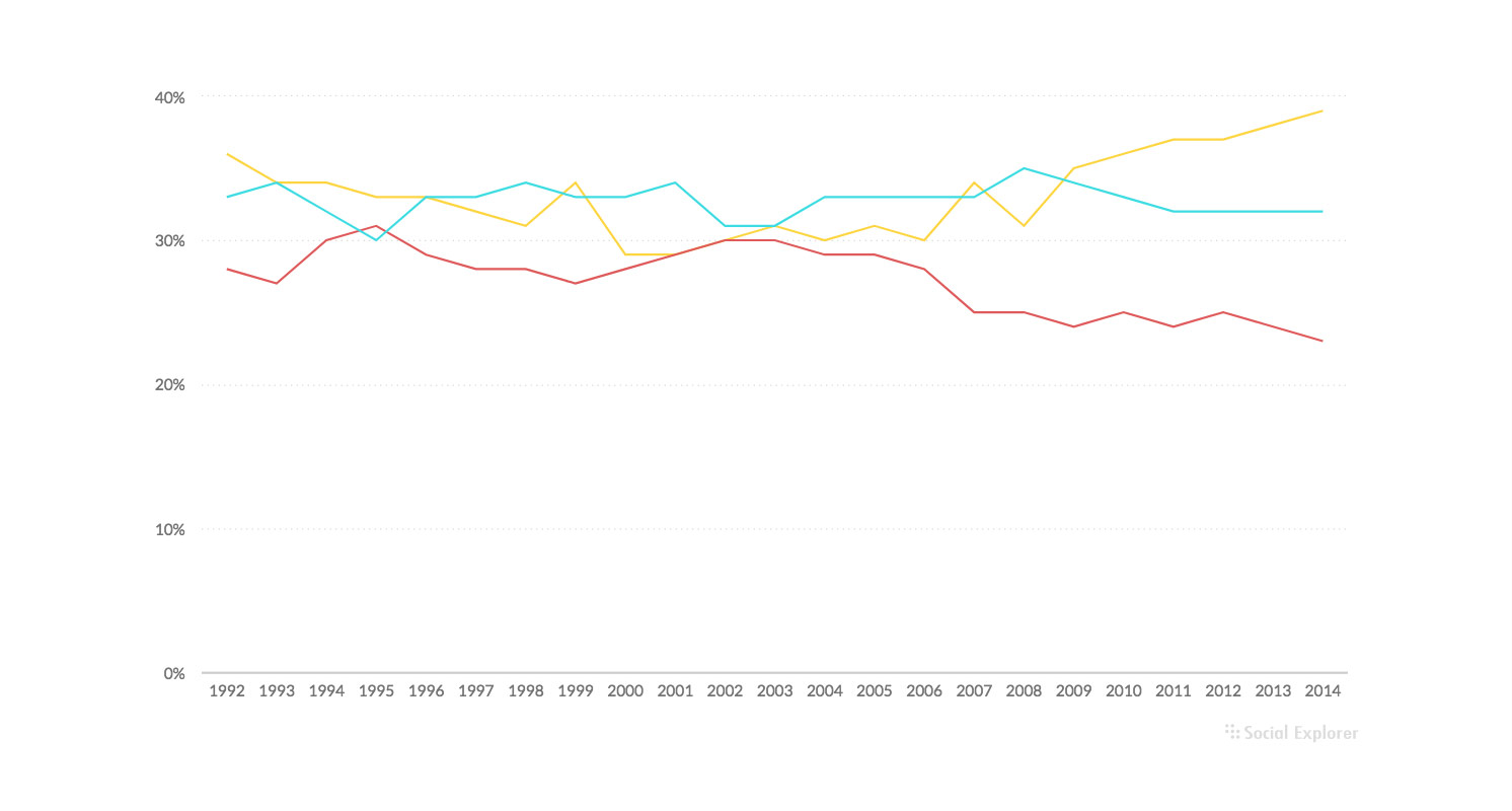
- Try not to visualize more than 5 series on a line chart
Good
Bad
- Don’t use grid lines if not necessary
Use gridlines only when they are essential for distinguishing data values.
Good
Bad

Scaling
- Start axis at 0 value (even though you don’t have any data close to zero point)
Most users are used to axis starting at zero, and in most times they instinctively assume that. To avoid misleading appereance of your visualization, always start axis at 0 value.
Good
Bad
Ordering
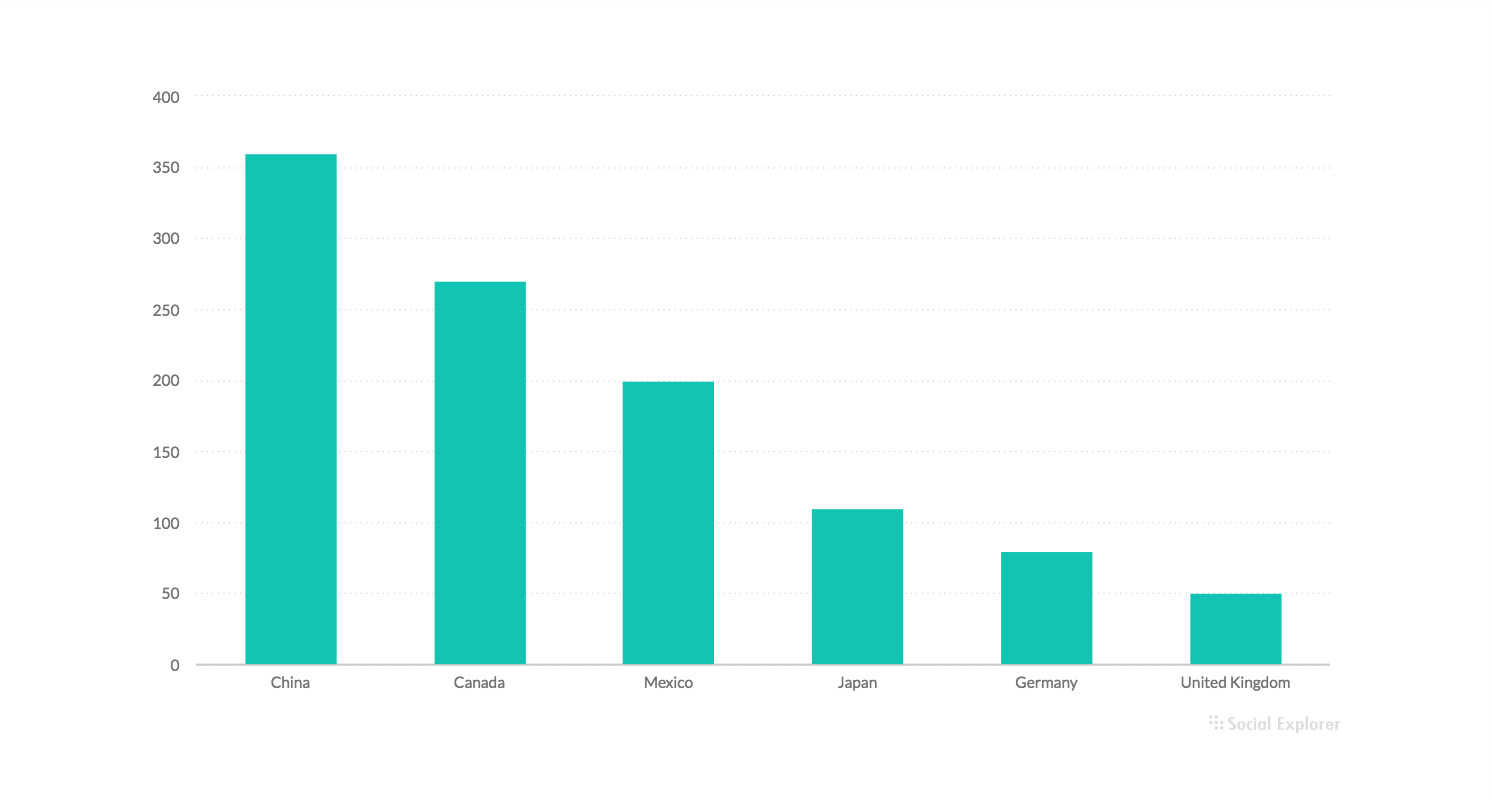
- Order data
Unordered data can make visualization look unappealing and users my not engage if there is too much effort in comparing the values by themselves. Ordering your data helps users to compare data with less effort and to spot trends more easily.
Good
Bad

Labeling
- Use horizontal labels
To ensure better readability try to follow standard text orientation when adding labels to your visualization.
Good
Bad
- Use value labels when you find it important
Value labels are useful when your visualization is dealing with big numbers. Adding values labels saves users time in getting all the information they need.

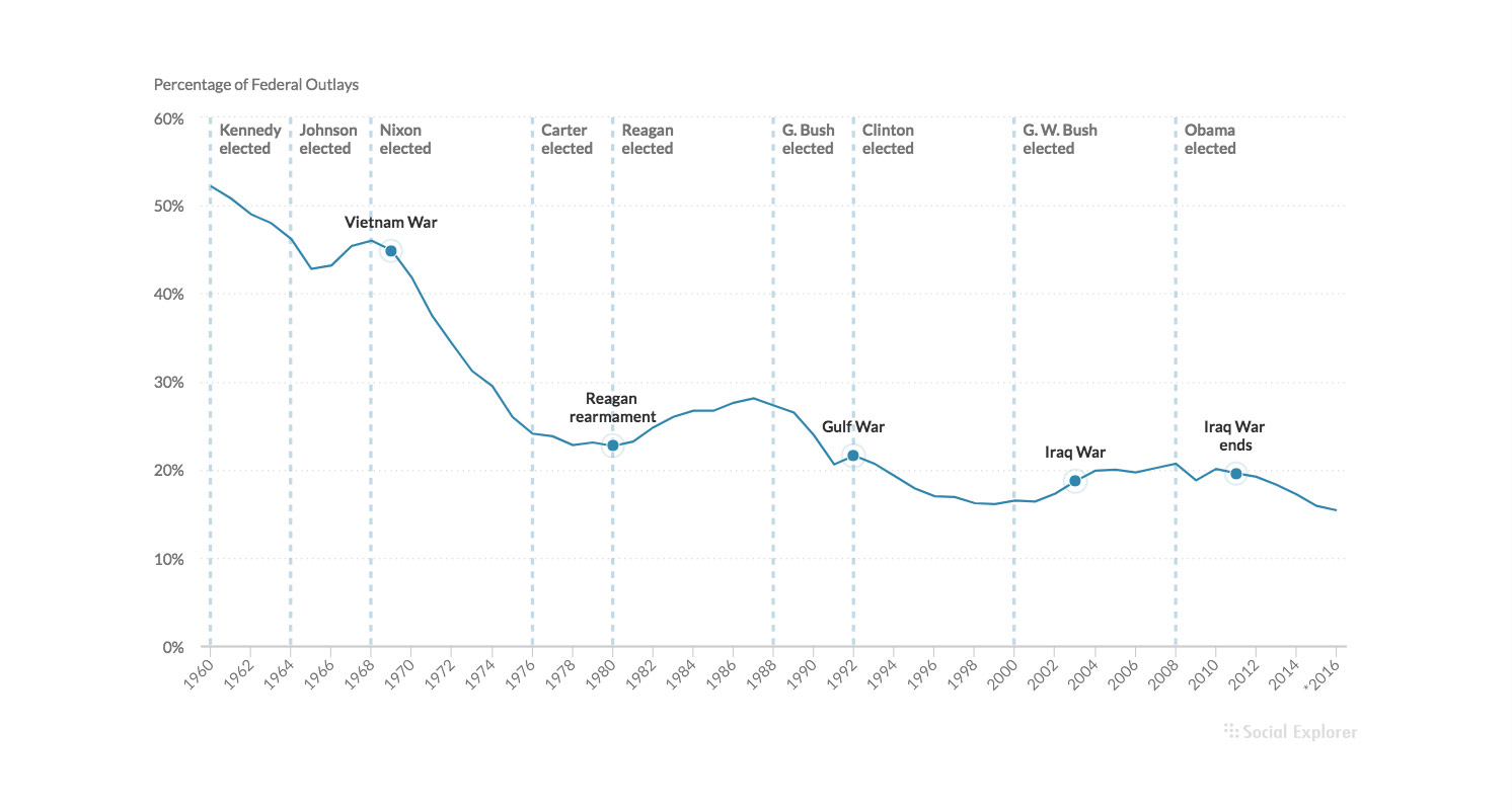
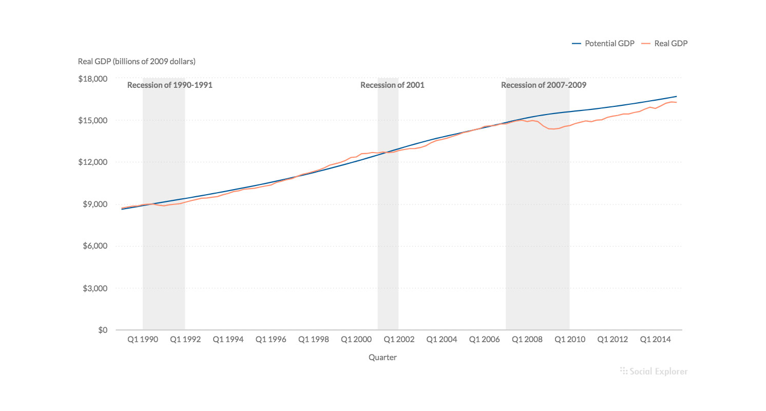
Annotating
- Use annotations to highlight data points and add additional information.
Point and line annotations come in handy when you want to highlight and add more information to a single data point.
Range annotations are used to highlight more data values that share something in common, or to point out a trend.
Add color and labels to your annotations to further enrich content.
- Use proper coloring to highlight categories
Colors may not seem that important when you visualize data, but if you use them properly they can enhance you visualization and spare you some additional explaining. Try to use pastel colors but also pay attention that the colors you choose are accessible for people with visual impairments.
- Use writing according to your target audience
When adding text to your visualization, you should have in mind what type of audience will read it. If the visualization is intended for the general public, try to use simple wording and explanations. For audience of business professionals or academic community, feel free to use business and scientific terminology that you find necessary.