Emphasizing important data
It shouldn’t come as a surprise that charts, infographics, and other types of data visualization are becoming more popular and fully integrated into the fabric of modern communication. After all, when you’re going through a social media newsfeed, or skimming through a book, your attention is more likely to be drawn to an image or an infographic than a wall of text and numbers. However, most graphs today communicate poorly.
Thanks to computers, smartphones, and affordable apps and software, creating a chart is a simple task. Creating an effective chart, on the other hand, is a completely different story.
This short guide will help you:
- Remove pointless design elements
- Reduce remaining design elements
- Reduce non-essential data
- Emphasize important data
Remove redundant design elements
What many fail to remember is that charts, just like standard tables, are used to communicate a message, albeit in a different way. While standard tables use words and numbers, charts use shapes, lines, and colors to convey that same message. The problem arises when zealous users get carried away and focus on the design more than the actual data and the message they’re trying to convey.
When working on a chart, always keep in mind that the data you’re visualizing comes above all else. Ask yourself: Would the data suffer any loss of meaning or impact if this were eliminated?
The first thing you’ll want to do when trying to emphasize the data you’re visualizing is check for any non-essential design elements that might detract from your message.
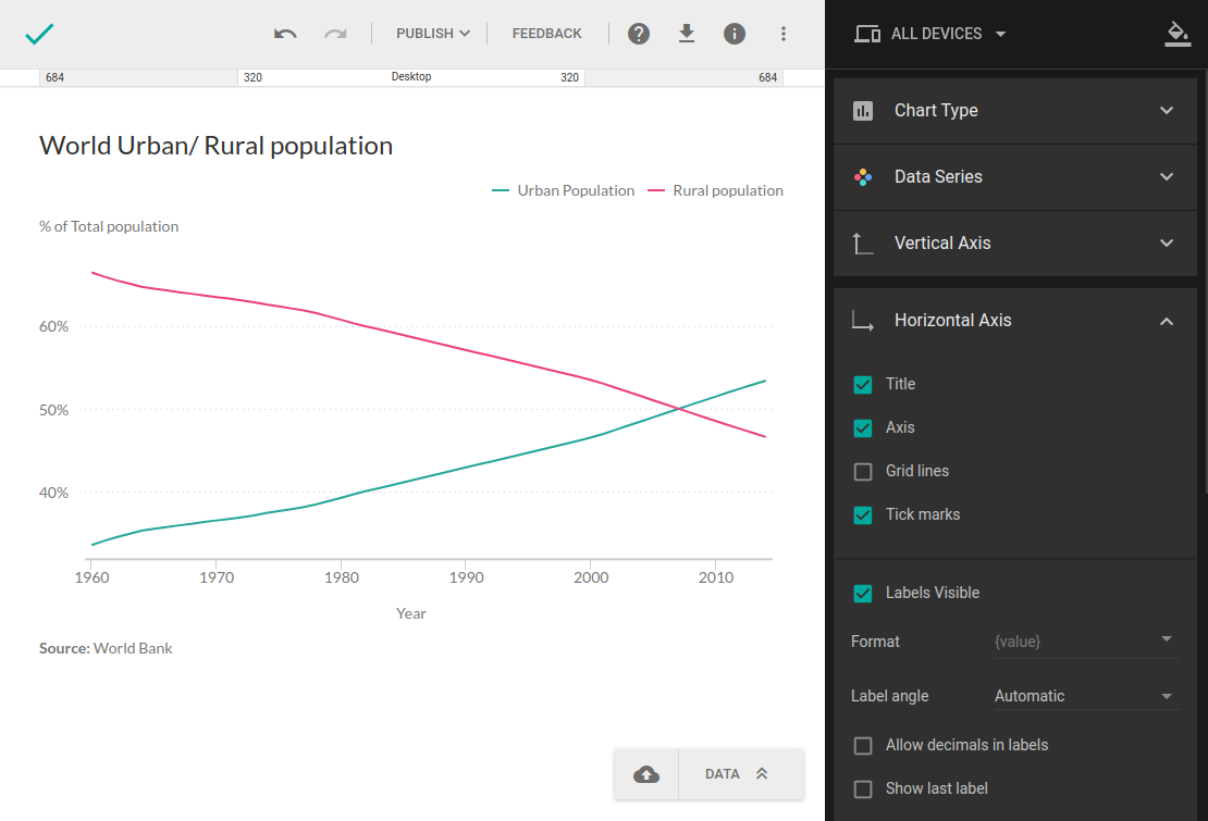
Grid lines
While useful when guiding the reader’s eye from the axis label to the data point, they can feel redundant, especially with simpler charts. Furthermore, when you use grid lines, it’s important to decide if you need them on both the x-axis and the y-axis. Oftentimes, you’ll need them only on one or the other. Let’s try removing the x-axis gridlines, as we’re working on a rather simple chart, and see if the chart looks any better.
- In the upper-right corner, click Edit.
- In the right-hand sidebar, click Horizontal Axis.
- To remove the axis line itself, uncheck the checkbox next to Axis.
- To remove grid lines in the chart, click the checkbox next to Grid lines.
- To remove tick marks on the axis line, click the checkbox next to Tick marks.
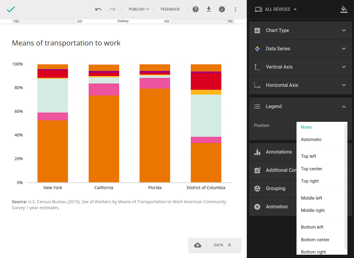
Legend
While the legend can come in handy with complex charts and describe chart components using color and symbols, it’s not always absolutely necessary, especially if you’re working with just one series. In that case, you might be better off leaving it out altogether and mentioning what the chart is about in the chart title.
- In the upper-right corner, click Edit.
- Click Legend to access the legend customization menu.
- From the Position drop-down, choose None to hide the legend.
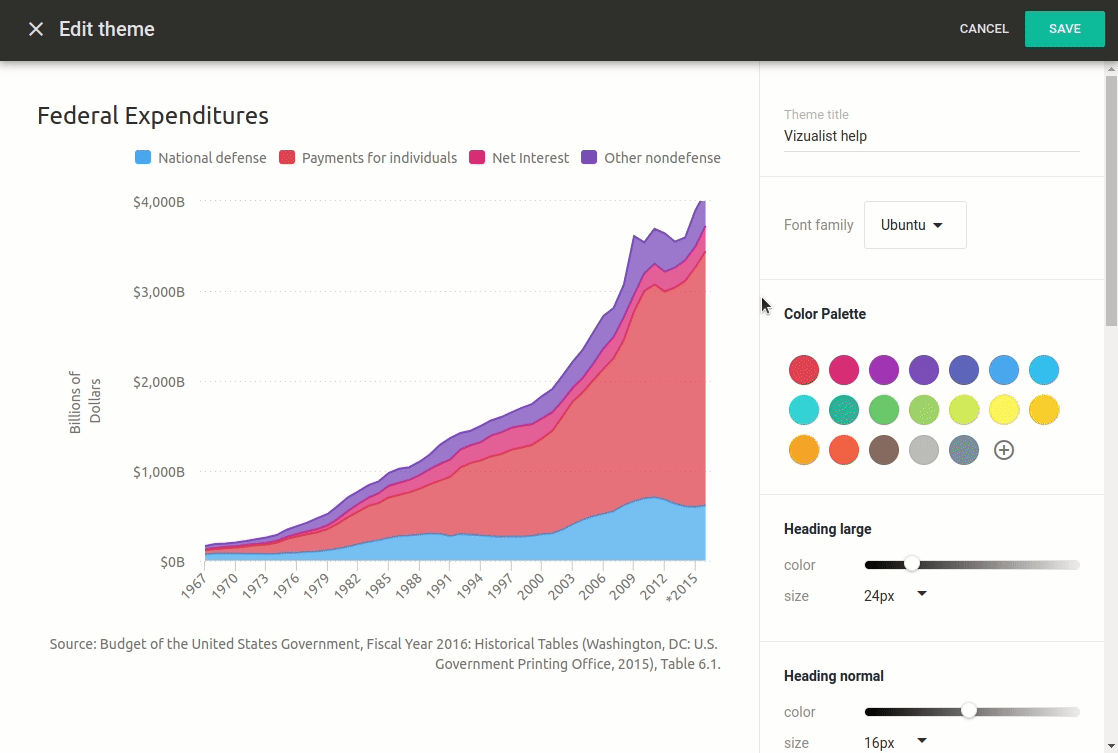
Reduce remaining design elements when creating a theme
While removing unnecessary design elements is crucial to declutter your chart, it’s just the first step. Remember, the focal point of every chart is the data, so make sure the remaining design elements don’t overshadow the data itself. To customize these elements, we’ll need to go into the theme editor.
- In the upper-right corner, click Edit.
- In the top right corner, click the theme icon
 .
. - Select the theme you want to customize.
- Click New theme.
This will create a copy of the theme you selected and all changes will be applied to that copy, and not the original theme.
In the right-hand sidebar, you can tweak the color and size of the font used in axis titles and labels, as well as value labels. Charts also allows you to set the font size and opacity for the heading, or the chart title. Keep in mind that the larger and bolder the fonts, the more noticeable they become, so you’ll want to lower the opacity and the font size to let your data shine.
If you decide to include the axes, grid lines, and tick marks, you can play around with the settings to make sure they don’t overshadow the data. When working with axis lines, you can lower the opacity and set their thickness by entering thickness in pixels.
Reduce non-essential data
While the goal of each chart is to communicate a message, you’ll want to make sure you’re not saying too much. This is especially true when your readers don’t have the time, or the patience, to sit there trying to decipher your chart. Don’t remove anything crucial to the message you’re trying to convey, but do try to remove everything that doesn’t add value to your message or your audiences. After all, the more you reduce unnecessary data, the easier it will be for important data to stand out.
Emphasize important data
Now that we’ve removed all design elements and data that don’t necessarily contribute to the message you’re trying to convey, let’s focus on bringing the important data front and center. There are a few no-brainer hacks you can try out for pretty much instant results and we can group them in two categories:
- Organize data
- Use text
Organize data
A majority of people, at least in the western world, read from left to right and from top to bottom. While not mandatory, you’ll want to consider placing the most important data in the top-left, or at least on the left of your chart. Let’s check out a couple of ways to do that in column charts.
- Open the chart you want to edit.
- In the upper-right corner, click Edit.
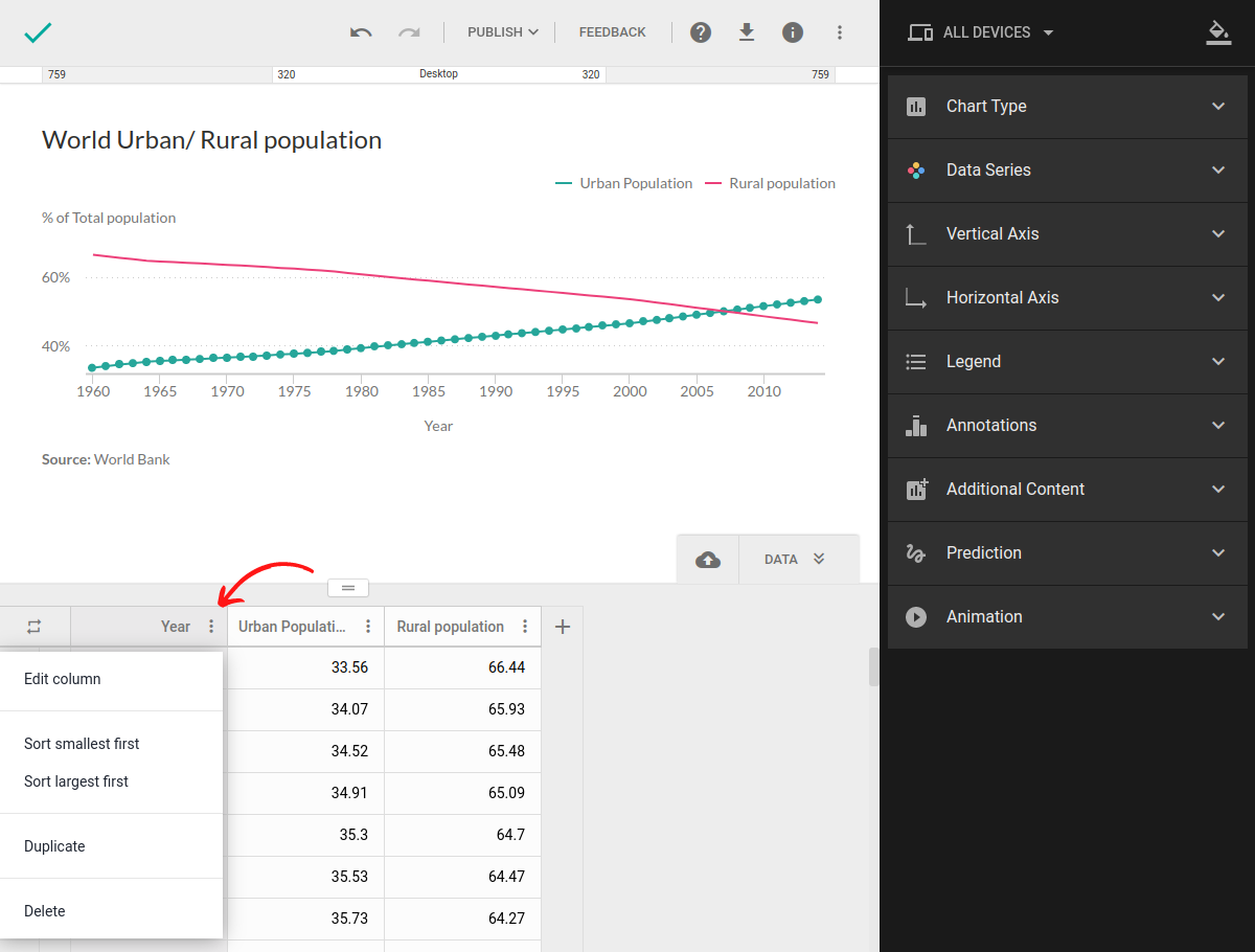
- In the bottom-right corner, click DATA.
- Next to column name click the more icon .
- Select the sorting option you want to apply.
All changes will be automatically applied to the chart as well, and if you sort the column by value, the columns will be reordered to mirror the changes in the table.
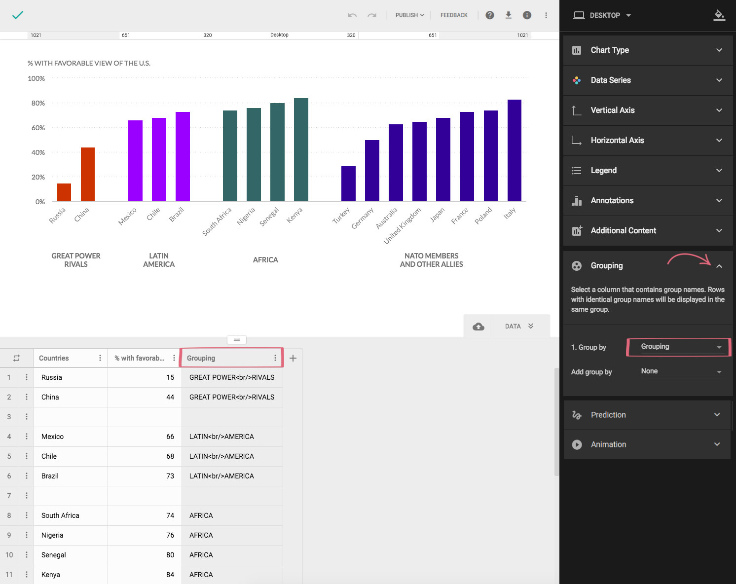
Group series
If sorting values by value doesn’t work with your data and the message you’re trying to convey, another way to organize your data is by placing similar values close to each other. The human eye automatically starts looking for patterns and ways to organize information. Your job is to help your readers, otherwise they might abandon your chart if you make it too complicated to notice patterns.
- Open the chart you want to edit.
- In the upper-right corner, click Edit.
- In the bottom-right corner, click DATA.
- Add new column.
- Enter the name of the group each row belongs to.
- In the right-hand sidebar, click Grouping.
Using symbols
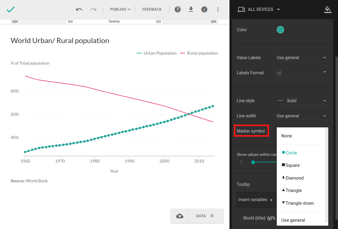
Symbols are yet another way to point out similarities in your data. By using similar, or even the same symbols for similar series, you will help your readers notice similarities. Let’s go ahead and check out the symbols included in the theme.
- In the upper-right corner, click Edit.
- Click Data Series to expand the section.
- Click a series to expand it.
- Next to Marker symbol, click to open the dropdown menu.
- Select the marker symbol you want to use for that particular series.
- From the Add group by dropdown, select the column with the group names.
Use text
Another way of emphasize important data is by using text. Text can be used to label, introduce, highlight, reinforce, and explain. Let’s check out some practical uses of text in Charts.
Heading
One of the very first things your audience will check out is the title of your chart, and a good title is invaluable. It should describe the type of quantitative and categorical information and let your readers know what to expect from the chart. Generic titles, such as Democrats vs Republicans, Population, GDP, or something in that vein, will not provide your readers with everything they need to know. Instead, go with more detailed titles, such as Percentages of Republicans, Democrats, and Independents in the United States 2004 – 2017.
- In the upper-right corner, click Edit.
- In the right-hand sidebar, click Additional Content to expand the section.
- Click the checkmark next to Heading to enable or disable it.
- In the chart you're working on, click the heading and edit or delete existing text, or enter new one.
Footnote
Footnotes are notes below charts and are typically used to cite references and sources or provide additional information. Long explanatory notes, however, can be difficult for readers to trudge through, so make sure you keep them simple and to the point.
- In the upper-right corner, click Edit.
- In the right-hand sidebar, click Additional Content to expand the section.
- Click the checkmark next to Footnote to enable or disable it.
- In the chart, click the footer and edit or delete existing text, or enter new one.
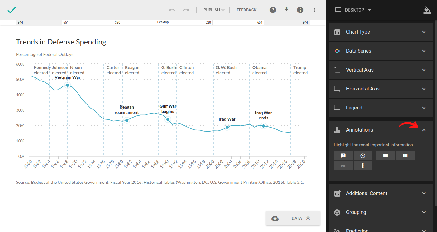
Annotate data
Writing a title and introduction isn't always enough to explain the chart to your readers but you can highlight the most important information on the chart using annotations. This helps guide readers through the chart and tells them what exactly to pay attention to. To learn more about annotation, check out this short article.