Create your first chart
Charts is a powerful visualization tool designed with usability in mind. With just a couple of clicks, whip up a chart that stands out from all the clutter, grabs attention, and instantly tells your story. Let's get started.
Add your data
Start working on your first chart by clicking the add ![]() on the right side of the Charts page in Vizualist dashboard. This will launch the Chart Wizard window. Since data is the most vital component of every chart, you begin by choosing one of the available data options:Try sample, Upload data, Google Sheets,Import FRED data, Statistics Canada and Social Explorer.
on the right side of the Charts page in Vizualist dashboard. This will launch the Chart Wizard window. Since data is the most vital component of every chart, you begin by choosing one of the available data options:Try sample, Upload data, Google Sheets,Import FRED data, Statistics Canada and Social Explorer.

- Try sample helps you create a chart by providing sample data for each chart type. If you would like to explore the Charts, want to see how some chart type looks like, or just need to create a chart and update the data later, this step will lead you to a meaningful chart in a single click.
- Upload data allows you to upload your own data before choosing a specific chart type. This step also includes recommendations of the most appropriate chart types based on your data.
- Google Sheets is fully supported by Charts. You can easily access all your Google Sheets as soon as you authenticate your account and grant access to Charts.
- Import FRED Economic data allows you to go a step further and dive into data extracted from Federal Reserve Bank of St. Louis (FRED) realtime API. You can set data frequency, allow automatic updates and use formulas to get even more from FRED data.
- Statistics Canada is the national statistical office. You can use the data information on Canada's economy, society and environment and create your chart.
- Social Explorer gives you access to all Census Bureau's Decennial Census and American Community Survey data.
Review your data
Whether you select Upload data, Google Sheets, FRED Economic data, or Import Statistics Canada data, once you load the data into Charts, you'll be taken to the Review window, where you can view all the data or enter the name of your chart. If you're happy with the data you loaded into Charts, click Next.
Charts will then recommend the chart types that work best with your particular data, but you can choose any of the 25 supported types. Select the type that works best with your data and click Next.
Preview your chart
Before actually creating the chart, you can preview it in the Preview window. If your visualization doesn’t look the way you expected, you can try transposing the data. You can even go back to the previous windows if the transpose feature doesn't help.
Charts with StatCan or FRED data is not possible to transpose.
When you're happy with the chart preview, click CREATE CHART.
Customize your chart
You've just created your first chart, now it is time to make your chart stand out. The easiest way to play around with the look and feel of your chart is by checking out the predefined themes.
Using themes
- In the upper-right corner, click the theme icon
 .
. - Click on any of the themes to preview it on your chart in real time.
- Click X in the upper-right corner if you're happy with the theme you've selected, or click New Theme if none of the included themes works for you.
- Enter the name of your theme and set the parameters in the right-hand panel.
- Click Save.

Customizing individual chart elements
You can choose any of the 25 different chart types organized by group.
- In the right-hand sidebar, click Chart Type to open the dropdown.
- Click the type you're interested in to see it in action.
Changes are applied in real time to the chart you're working on.
Series is a term used to refer to a set of values in your data set. Each series is a row or column of numbers that are graphed in a chart.
- In the right-hand sidebar, click Data Series to open the dropdown menu.
- To customize individual series, click the Series tab and select the series you want to customize.
- To customize all series at once, click the General tab.

Charts allows you to tweak vertical and horizontal axes and set their names and customize max and min values, and edit the legend. In addition to changing the legend's position, you can also enable legend interactivity. There are four modes that affect behavior on click:
- NONE – the legend is not interactive,
- HIDE – the series you click will be hidden in the chart,
- GRAY OUT – the series you click will be grayed out and not removed,
- FOCUS – highlights the series you click and grays out the other series.

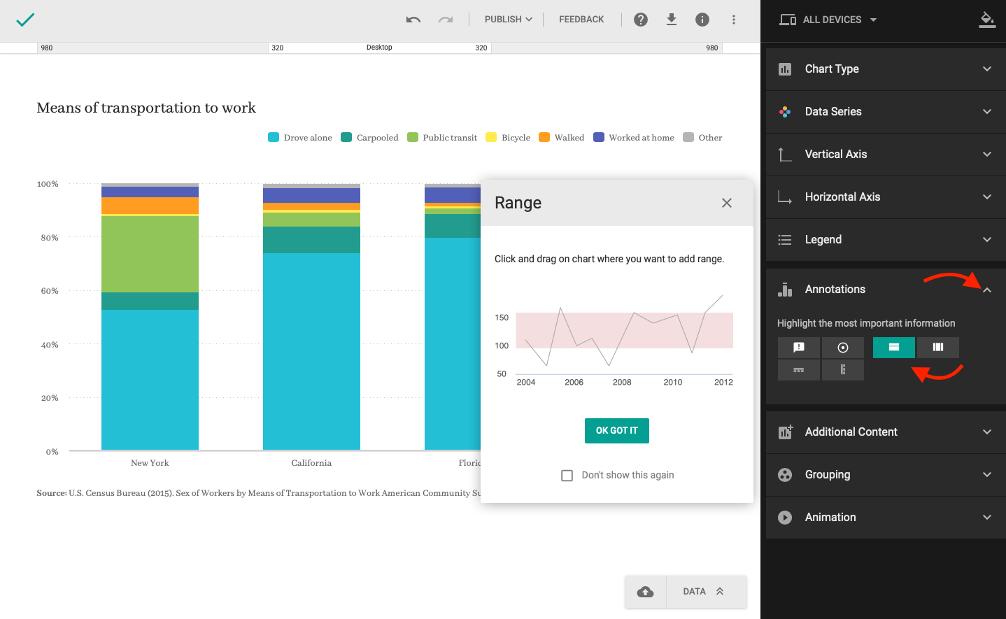
Annotations can be useful when you want to highlight important information by adding a line or emphasizing a range.
Heading and footnote are available right under the Additional Content dropdown, where you can add overlay screens as well.
- In the right-hand sidebar, click Additional Content to open the dropdown menu.
- Click the checkbox to enable the overlay screen.
- Select the overlay type from the dropdown.
- Click the questionmark icon to open the overlay screen.
- Enter the text and click X when you're done to save it.
Set up a mobile version
So far, we've been working on a single version of your chart that will be displayed the same way on all devices. However, Charts allows you to set up a different version of your chart for mobile devices to ensure perfect readability.
- At the top of the right-hand sidebar, click All Devices to open the dropdown menu.
- Toggle on Multiple versions.
- At the top of the right-hand sidebar, click Desktop and cllick Up to 650px to switch to small screen version.
- Customize the look and feel of the mobile version just like you did with the desktop version.
Resizer helps you choose desired resolution so you can easily check how your chart fits in on practically any screen size.
When you finish editing your chart, click the done icon ![]() to save the chart.
to save the chart.