Data visualization guidebook
Good data visualization skills are becoming vital in many fields. Data visualization helps you communicate your point visually, clearly, and quickly. This is especially effective when communicating with people who are short on time and unable or unwilling to read reports with tables of numbers. Whether it be higher management or casual blog readers, presenting data visually speeds your communication significantly.
Learning these basic data visualization skills will have a great impact on your career, your blog, your work, and the success of your project.
This guidebook will attempt to teach these basics skills to you. We hope you enjoy it.
Before we start…
Let’s go over some common terminology, and define key concepts:
-Variable s any characteristic, number, or quantity that can be measured or counted. Age, sex, income, expenses, country of birth, capital expenditure, class grades, eye colour and vehicle type are all examples of variables.
–Data Series is a row or column of numbers that are graphed in a chart. You can graph one or more data series in a chart. These data series can exist as rows or columns in a table. It depends on how the table is set up.
Example: Average Monthly Temperature for New York data
Data Series as rows
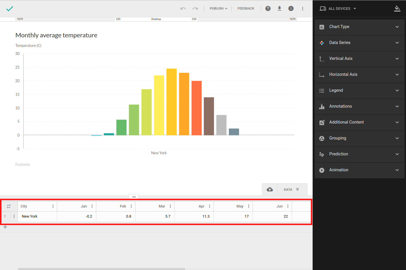
Data Series as columns
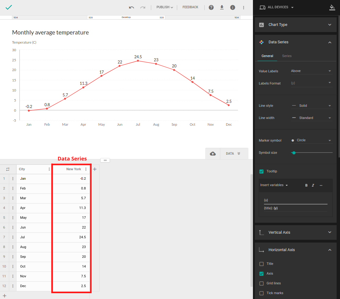
Average Monthly Temperature for New York visualized
As you can see in the example chart, every data point from the series has a corresponding point in a chart.
In case of a dataset with more than one series, each series is graphed independently.
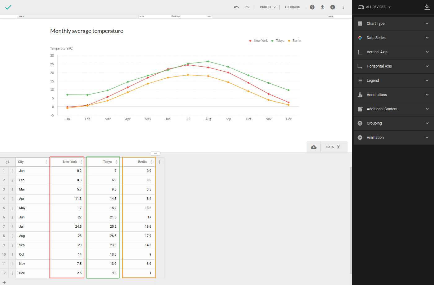
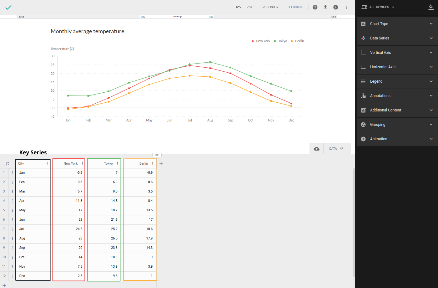
Example: Average Monthly Temperature for New York, Tokyo and Berlin

Time series is any series that contains time data points like dates, years, months etc.
Key series is series that forms the backbone of your dataset, if you remove it, your data doesn’t make any sense. All other series in dataset relate to key series. (its column is often marked as an ID column with unique values, or it can be a time series).
It is a convention that key series is first column of your dataset.
This series is never used as series on the chart.
Getting to know your data
No matter what your data is about, every data visualization has a story behind it. When it comes to visualizing data, being familiar with the topic is as important as choosing the right visualization. If you're not familiar with the topic you may end up with a misleading visualization.
Perspective and context play an important role in how your data is perceived.
Let's take a look at the example data of children not enrolled in school worldwide.

According to the World Bank, in 2011, almost 32 million girls were out of school (compared to 30 million boys). In the context of gender equality, this data is perceived as negative.
But when we add time perspective and compare the numbers through years, we find out that the number of girls out of school has never been lower and that the gender gap has never been smaller, and this finding is perceived as positive.
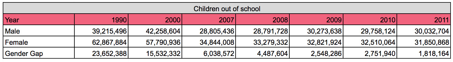
Notice how the same data can be perceived differently when we change our point of view.
This is why it is important to have a clear idea of what message you want to communicate before collecting and visualizing data. After you figure that out, you can start browsing for data.
The right visualization: a step by step approach
The idea is to simplify the process of decision making to only a few steps:
- Determining type of dataset you have
- Determining presentation type
What type of dataset do you have?
The first step is to analyze your dataset and determine its type.
Every dataset needs to have a key series and it is important to identify it correctly.
We classified datasets in two major categories:
- Point-in-time datasets
- Time-series datasets
Point-in-time datasets contain data about an occurrence at a specific point in time, for example GDP of countries in Europe, where key series would be country name.
Time-series dataset is any dataset that contains data about an occurrence measured over some time period. Key series in time-series dataset is also a time series, for example GDP of countries in Europe in the last 10 years, where key series would contain years data was measured.
To illustrate how to identify the key series, we provided the example dataset Health Expenditure and GDP Per Capita.
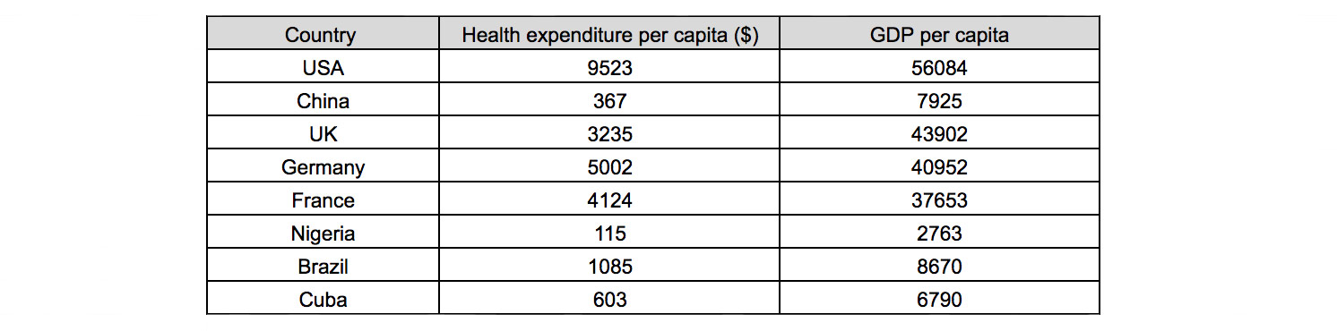
There are three series in this dataset: Country, Health expenditure per capita ($) and GDP per capita. Since all three series have unique values, key series is the one which all other series relate to. In this case, Country is the key series because the other two series contain data linked to the Country column values and not the other way around.
Once you identify the key series, the next step is to see if it is also a time series or not. In our case, key series Country is not a time series, meaning our example dataset is point-in-time.
Presentation types
Presentation type directly affects the message you are communicating.
Composition type shows how a part compares to the whole and how a total value of a series can be divided into shares.
Comparison type is used to compare the values between one or more series with the aim to find the lowest/highest values or different trends.

There are several types of visualizations that can be used for each dataset type, depending on the presentation type you choose.
Point-in-time dataset
Composition
One Series
Under five categories
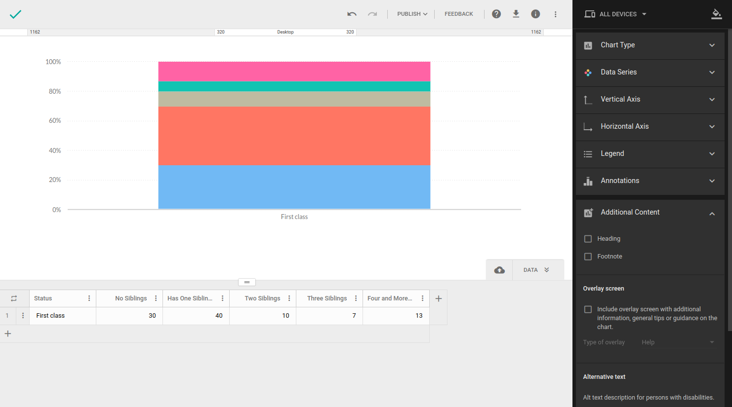
Datasets presenting composition of 1 series containing under 5 categories (data points). The most common type of visualization for a simple share of totals is a pie chart. This visualization type is the easiest way to visualize composition but its design makes it hard to notice small differences in values.
Example: How many siblings do students of one class have, in percents (1 Series, 3 categories)
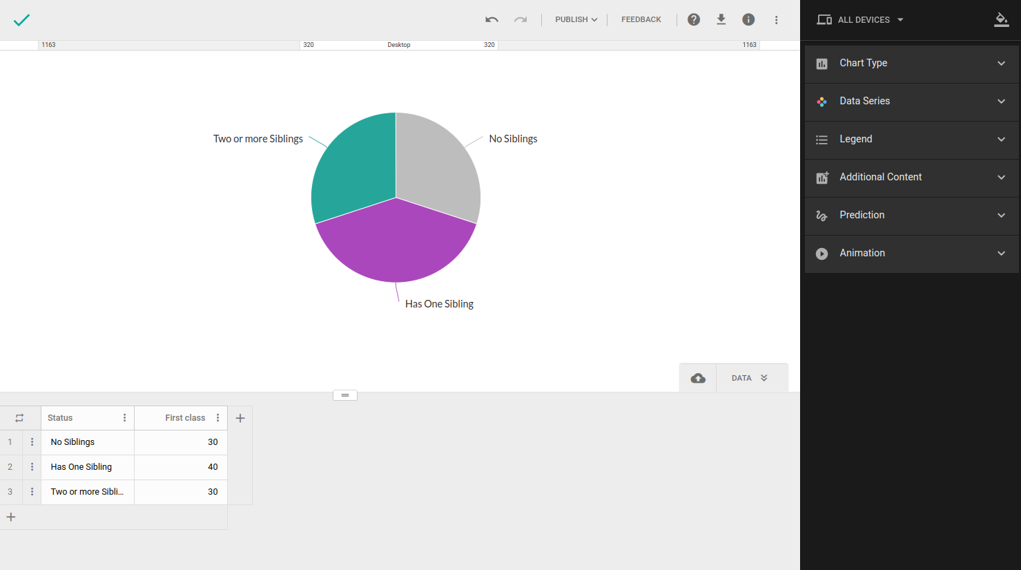
Tips:
-Data presented by pie charts always has to add up to 100%.
-You should use it for a maximum of 5 categories if you want to keep your chart neat and easy to read. (If you have more than 5 categories consider using column/bar chart)
-Slices should be ordered from largest to smallest value to make it easier to read
-Don’t use multiple pie charts for comparison
Over five categories
Composition of 1 series with 5 or more categories
Pie charts containing 5 or more categories may appear overcrowded and hard to read, so in this case, a stacked bar or column chart is a better option.
Example: Let’s get back to our class from previous example and assume we have a more detailed breakdown of categories by number of siblings. (1 Series, 5 categories)
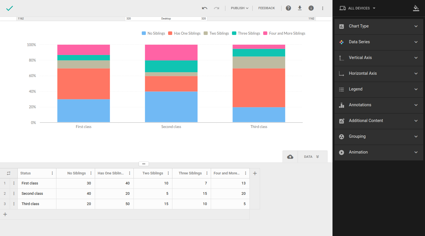
Two or more series – Composition of multiple series
If you want to represent the share of the total of multiple series, instead of making multiple pie charts you should use a column/bar stacked chart.
Each column/bar should present one whole (series), thus it has to add up to 100%. This type of chart allows you to present parts of a whole that would usually be visualized independently.
Example: Our previous datasets contained data only about one class (series), we can extend it by adding data about two additional classes to create a dataset with multiple series.
(3 Series, 5 categories)
Comparison
One Series
The most common visualization used to compare values across one series is a column/bar chart. Unlike in composition, values in one series don’t have to make a whole.
Example: Television ownership across countries (1 Series, 4 categories)
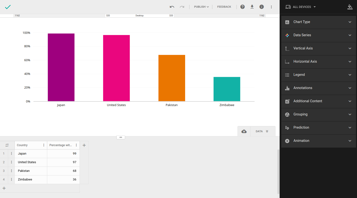
-Suitable to represent many categories
-Easier to represent the difference between values (you can use value labels for showing the exact value of each column/bar).
Two or more series
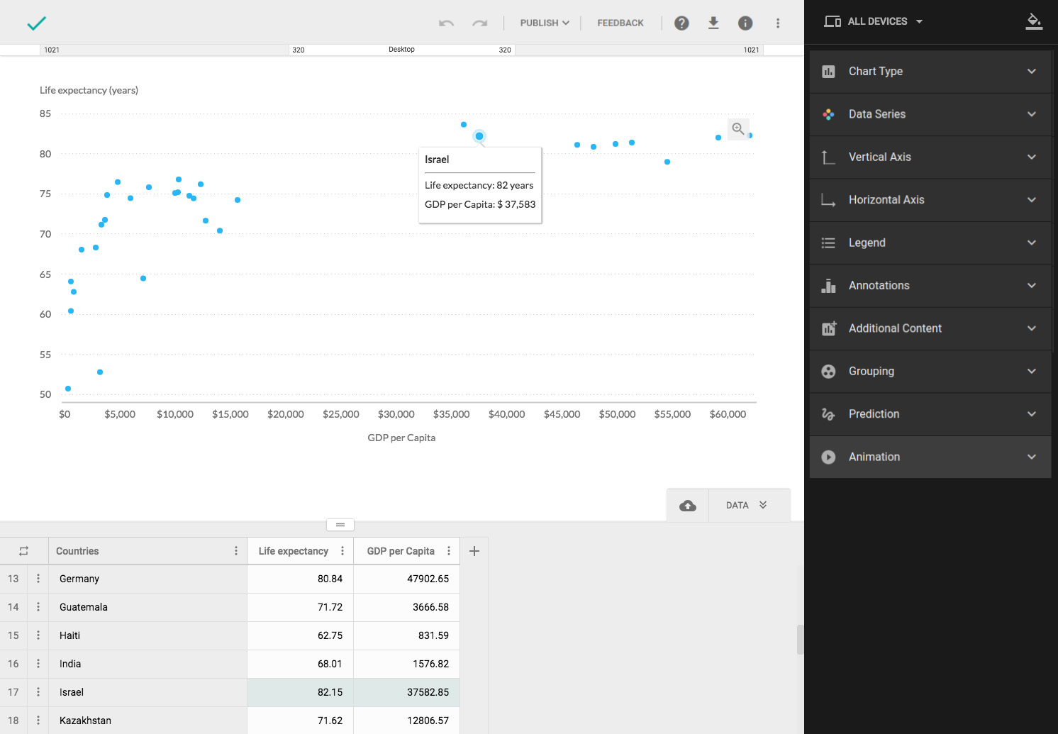
Scatter plots show how one series affects another, meaning you can visualize relationships and trends in the data.
Each point is plotted based on the values of each axis, series values act like x-y coordinates. They are the best option for large datasets.
Example: Dataset containing life expectancy and gdp of world countries. (2 Series, 10 categories)
Similar to scatter plots, bubble chart is used to compare three series, where the third series can be visualized by the size of the bubble.
Time-series Dataset
Composition
What type of chart will be used for your composition type will depend on the time series from your dataset and how many time periods it has.
Few periods
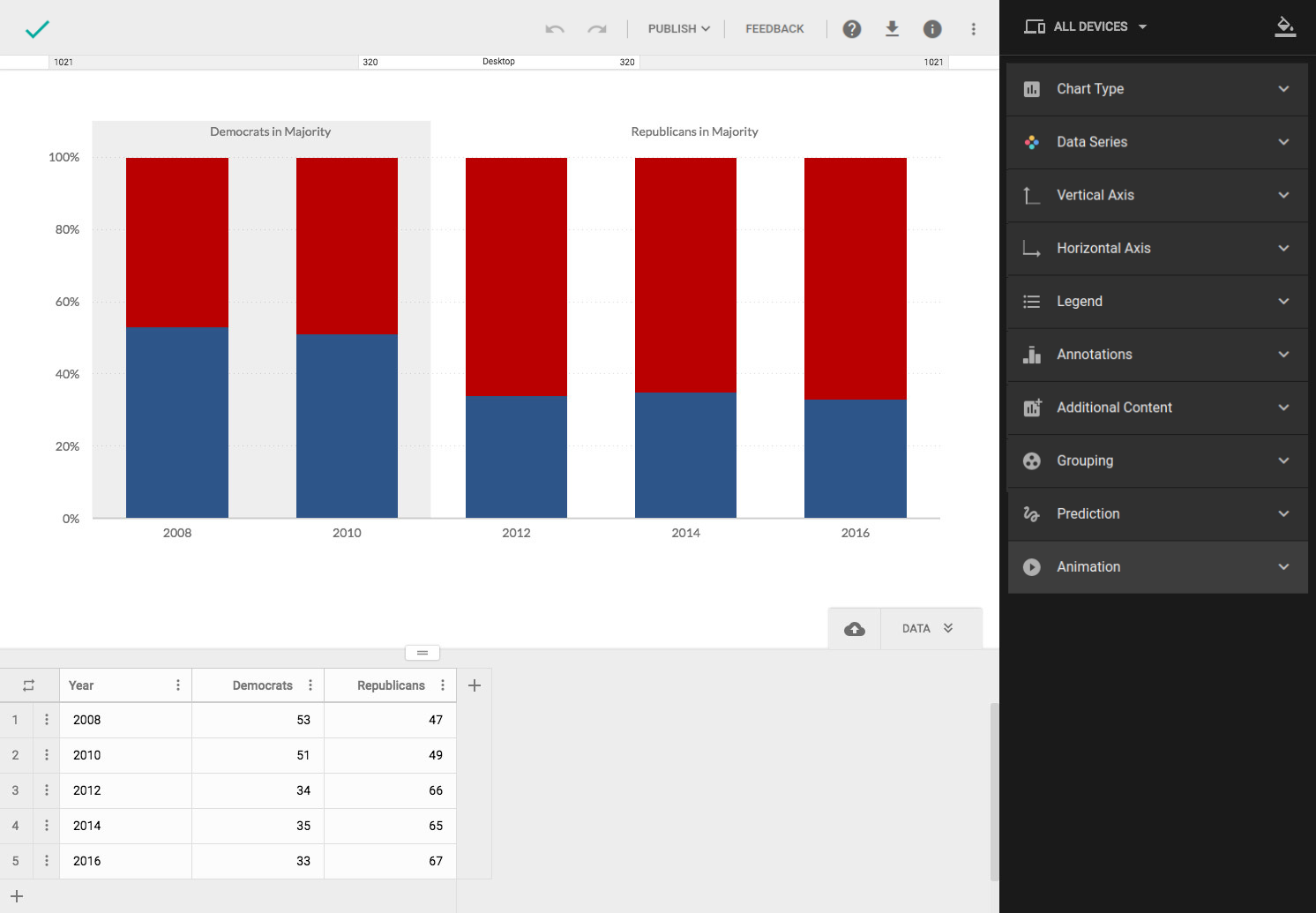
If there are few time periods (5 or fewer), the best option would be to use a column/bar stacked chart.
Example: Change in composition of PAC Contributions over a period of years. (2 Series, 5 categories)
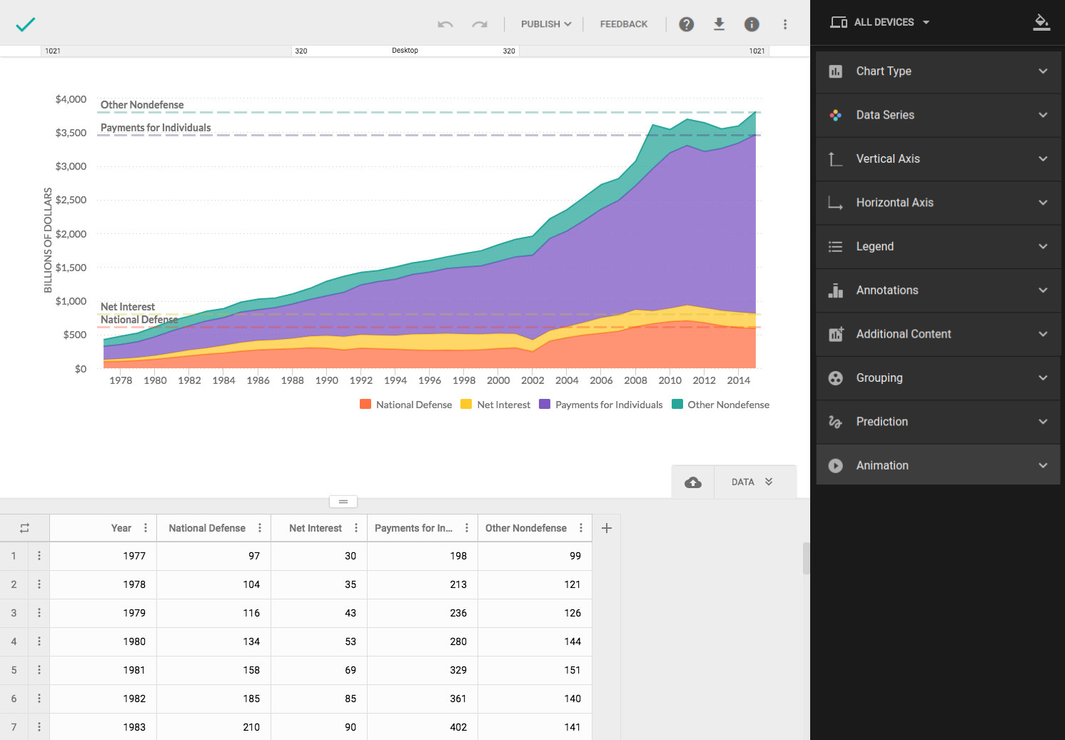
Five or more periods
If you have a time series with more than 5 time periods, the best option would be to use an area chart. Example: The change in composition of Federal expenditures for many time periods (4 Series, 10+ time points – categories)
Comparison
Visualization type for comparison also depends on the time series from your dataset and how many time periods it has.
Few periods
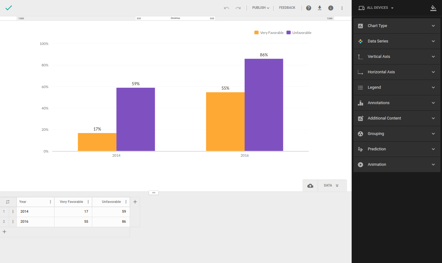
If there are few time periods (5 or fewer), the best option would be to use a column bar chart.
Example: Political polarization in the American public in 1994 and 2016. (2 Series, 2 time points – categories)
Five or more periods
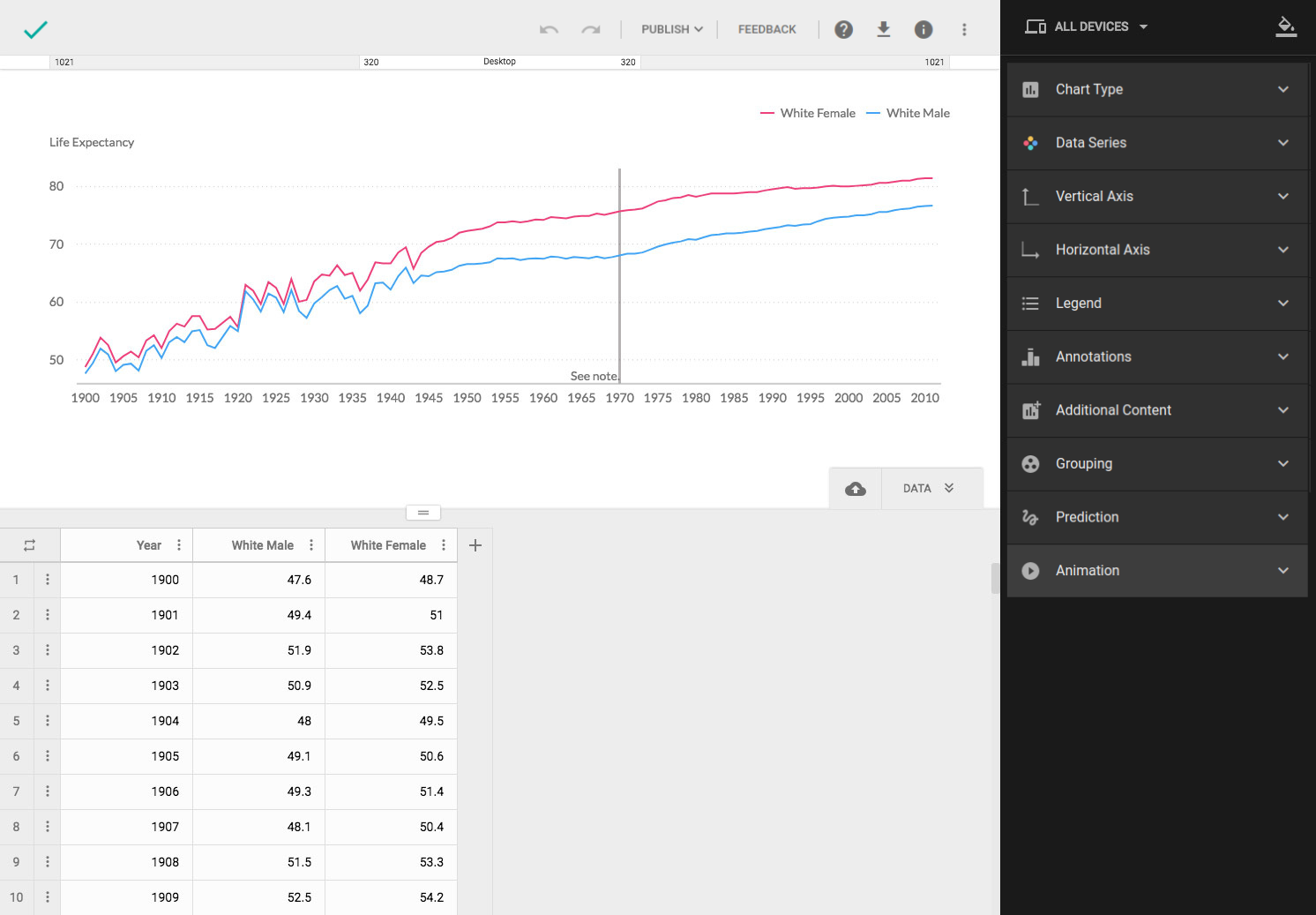
For comparing values over many time periods (five or more) use line chart.
Example: Changes in life expectancy from 1900 to 2011 (2 Series, 10+ time points – categories)