Upload data – Charts
The heart of every great chart is the data used to create it. However, you might not always have the data ready. Using Charts, you can use one of our sample charts, try sample, upload as a CSV file from your computer, import data from Google Sheets, access FRED data, access data from Statistics Canada, or browse the Social Explorer database.
Try sample
If you want to try out a chart which contains sample data follow these steps:
-
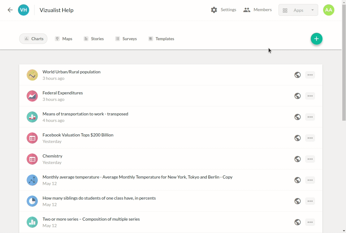
Open project in Vizualist dashboard, select Charts aplication.
-
In the upper-right corner, click the add icon
 .
. -
Select Try sample.
-
Choose a sample chart from the list.
-
Click on Try the sample.
Upload data
Charts allows you to upload data and create interactive charts. To do so, please follow these steps:
-
Open project in Vizualist dashboard, select Charts aplication.
-
In the upper-right corner, click the add icon
. -
Select Upload Data.
-
Click on browse or drag and drop your data.
Data can be upload also by drag and drop file from you computer.
-
In the Name field, type in the name of your chart.
-
Choose a chart type.
-
Click on Next.
-
Preview your chart and click on Create chart.
Google Sheets
To import data from Google Sheets, please follow these steps:
-
Open project in Vizualist dashboard, select Charts aplication.
-
In the upper-right corner, click the add icon
. -
Select Google Sheets.
-
Select your Vizualist account.
-
Click on Allow.
-
Choose a spreadsheet that you would like to import.
-
Click on Load.
-
In the Name field, type in the name of your chart.
-
Choose a chart type and click on Next.
-
Preview your chart and click on Create chart.
Federal Reserve Economic data (FRED)
To import data from FRED (Federal Reserve Economic data), please follow these steps:
-
Open project in Vizualist dashboard, select Charts aplication.
-
In the upper-right corner, click the add icon
. -
Select FRED (Federal Reserve Economic data).
-
Type in a series name or series ID and search for FRED data.
-
Select the series you would like to have within your chart.
The following options allow you to tweak your series:
- Click on the dropdown menu under “Units” to choose the unit you would like to have.
- Click on “Find a data series” to have multiple series in your chart.
- Click on “Formula” to create a formula to calculate the series.
- Select the dropdown menu under “Frequency” to determine the frequency of the data for the chart.
- Select the dropdown menu under “Observation range” to determine when the observation will start. You will be able to choose a date or quantity for the period.
-
Click on “Done”.
-
Have a final review of the series you created for your chart.
-
Click on “Load”.
-
In the Name field, type in the name of your chart.
-
Have a final review of your data and click on “Next”.
-
Choose a chart type and click on “Next”.
-
Have a final review of your chart and click on “Create Chart”.
Statistics Canada
-
Open project in Vizualist dashboard, select Charts aplication.
-
In the upper-right corner, click the add icon
. -
Select “Statistics Canada”.
-
Type in a vector ID and search for Statistics Canada data.
-
Select the vector you would like to have within your chart.
-
The following options allow you to tweak your vectors:
- Click on “Name” to change the name of your vector.
- Click on “Find a vector” to have multiple vectors in your chart.
- Click on “Formula” to create a formula to calculate the vectors.
- Select the dropdown menu under “Observation range” to determine to determine when the observation will start. You will be able to choose a date or quantity for the period.
-
Click on “Done”.
-
Have a final review of the vectors you created for your chart.
-
Click on “Load”.
-
In the Name field, type in the name of your chart.
-
Have a final review of your data and click on “Next”.
-
Choose a chart type and click on “Next”.
-
Have a final review of your chart and click on “Create Chart”.

Social Explorer
Social Explorer is a platform containing demographic data from various sources. Data is available through custom made reports and some of them include US Census data, American Community Survey (ACS) data and Election data.
Using Social Explorer data integration you can access comprehensive demographic data on different geography levels and compare data across states, counties and other geography levels.
-
Open project in Vizualist dashboard, select Charts aplication.
-
In the upper-right corner, click the add icon
. -
Select Social Explorer.
-
Choose a survey and year.
-
Choose a dataset.
-
Add variable/s.
-
Select variable/s.
-
Click on Done.
-
Add geography.
-
Select geography/ies.
-
Click on Load.
-
In the Name field, type in the name of your chart.
-
Click on Next.
-
Choose a chart type.
-
Click on Next.
-
Preview your chart and click on Create chart.